Newport Street Gallery
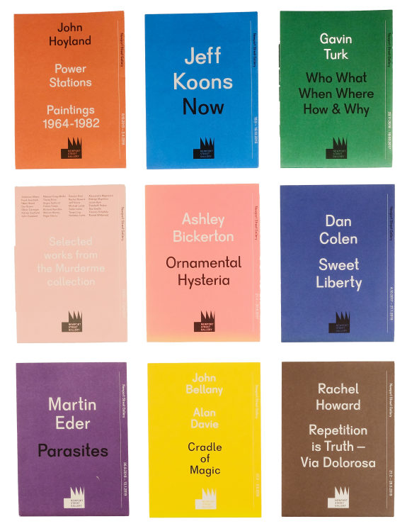
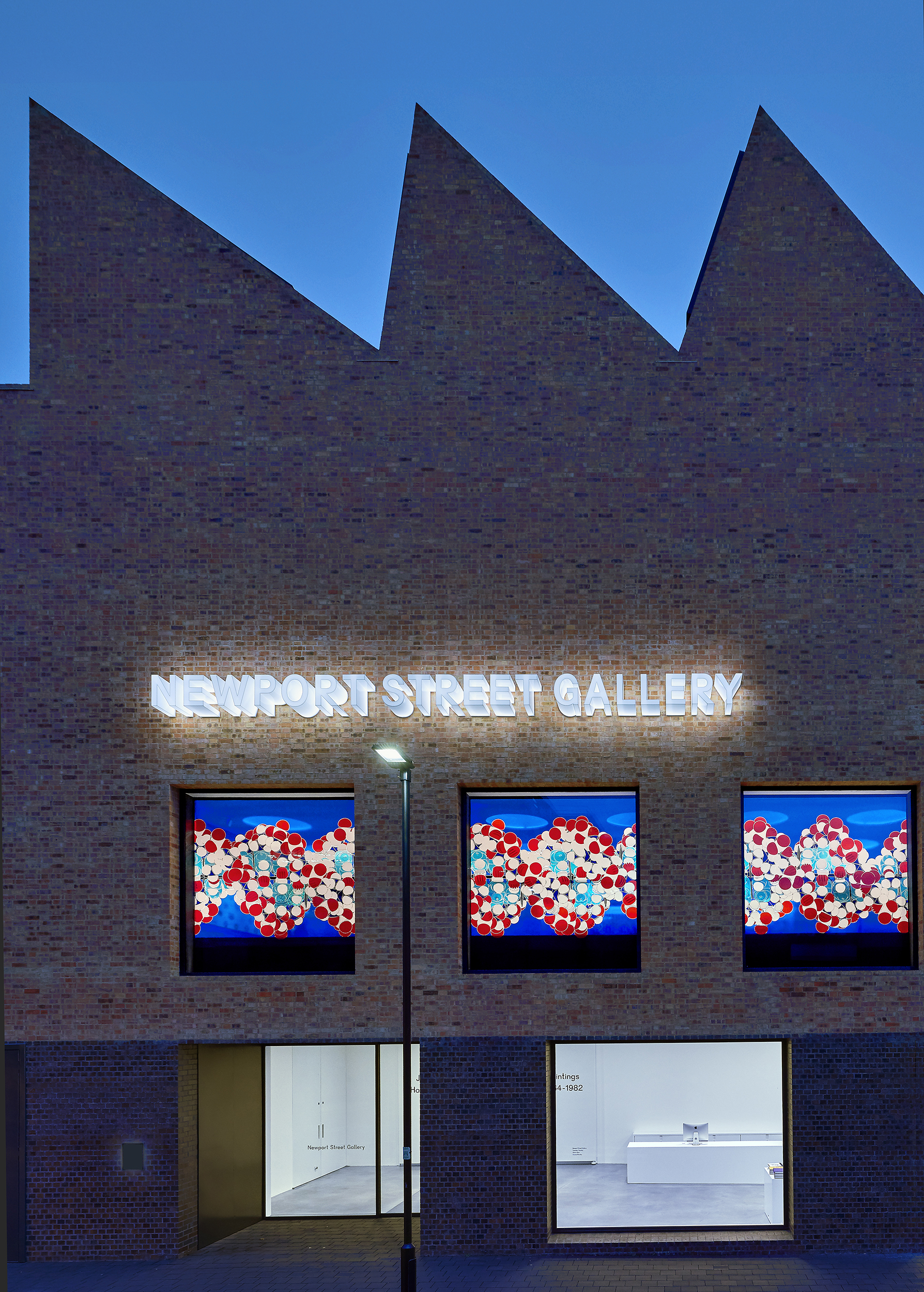
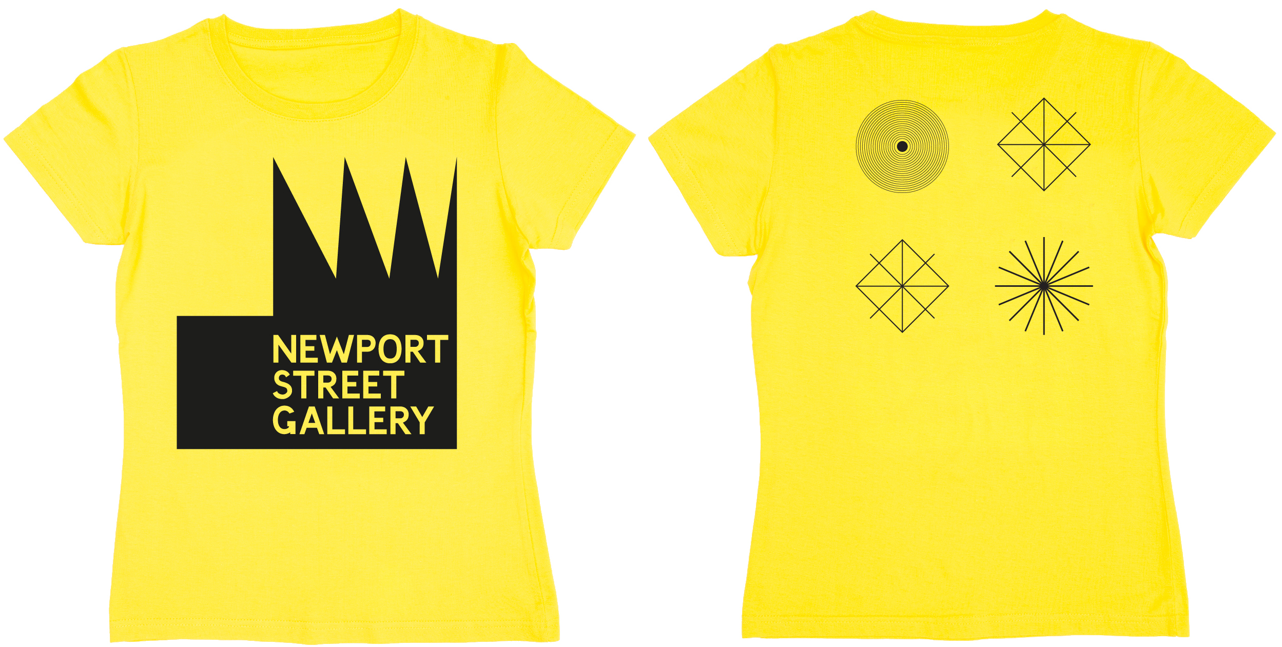
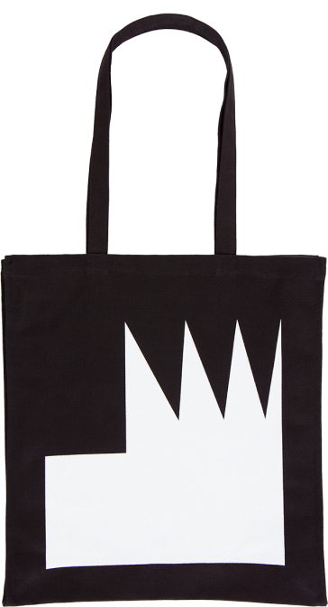
An identity with a number of fixed logotypes, adaptable for use in multiple formats. The two main logos draw heavily on architectural features of the building itself, one from the sawtooth roof, which was part of the new building but drew on the language of 19th-century industrial architecture, another from architectural detailing from the existing building. Both elements were simplified into monochrome geometric shapes and paired with a custom-drawn font deriving from London road signs in the early 20th century. The main signage for the building was made from individual, block-like Perspex letters, each extruding from the building’s façade and internally lit. The identity was used throughout: from the 30ft external LED screen to internal signage and staff uniforms. A fold out leaflet was created for each exhibition in a uniform format. One side shows a list of works and exhibition placement, the reverse contained explanatory text about the exhibition.
